A Math Tool for Every Occasion
The charge was to make math more engaging and improve how we measure math skills by leveraging 21st century technology. Issue was, our company’s existing math component library was dated in its functionality, accessibility, UI, and UX. I lead this project by providing end-to-end project management, client-facing reviews, and the complete UI/UX re-design of 17 math components.
Before/After
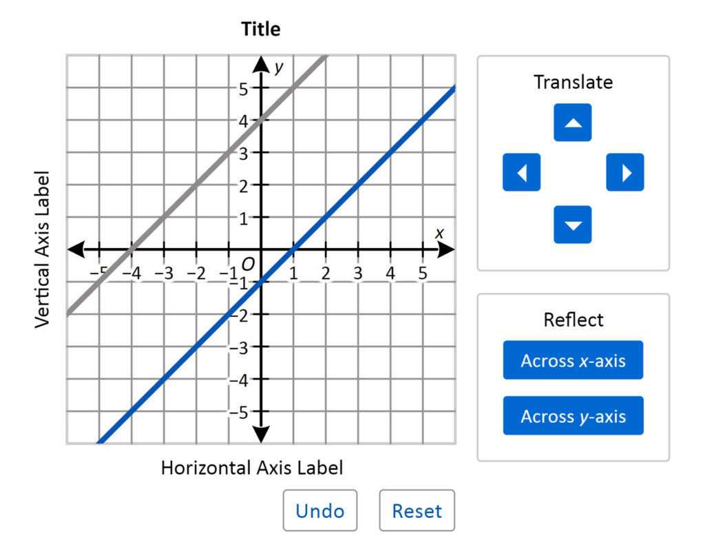
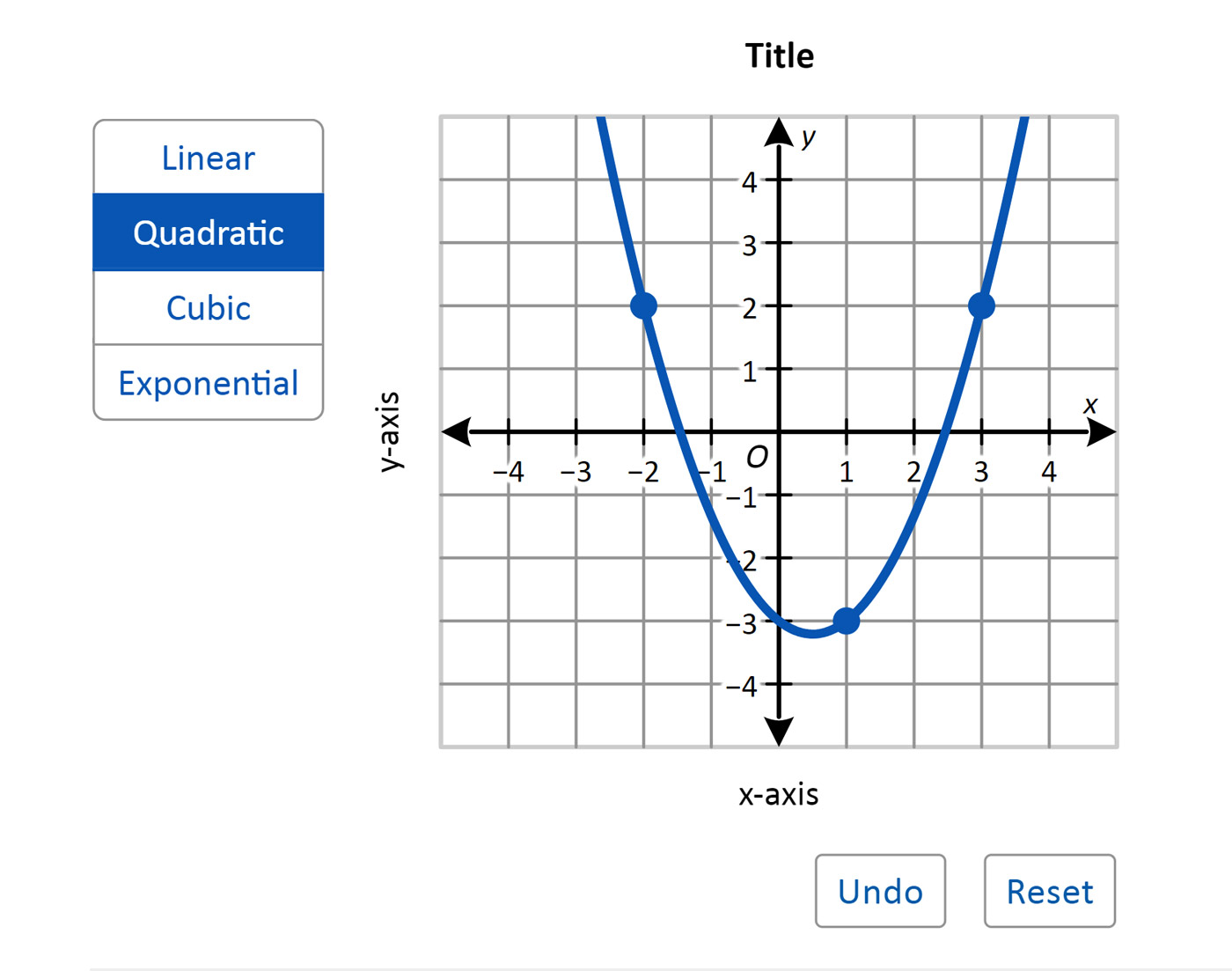
Function Transformation
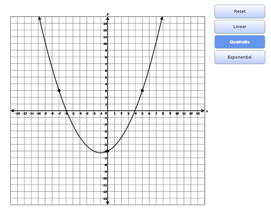
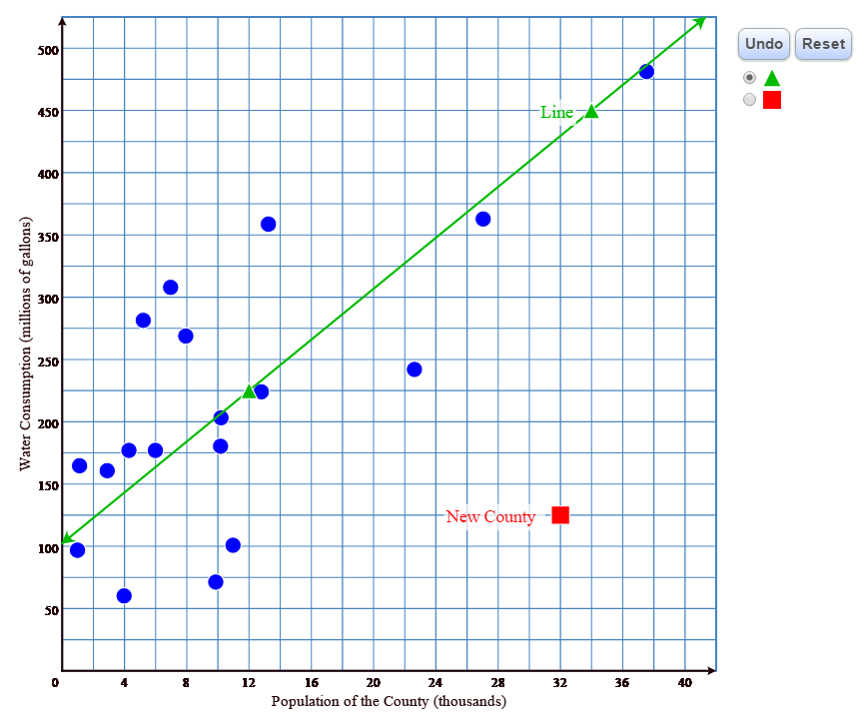
Function Graph
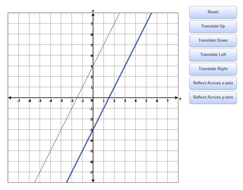
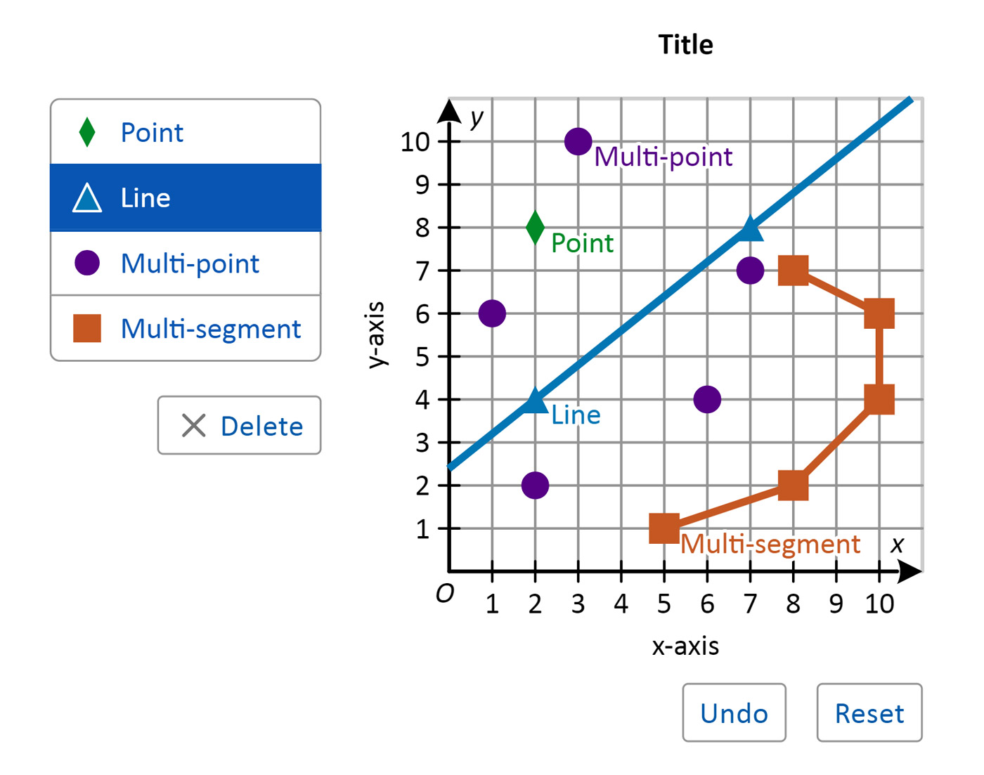
Line and Point
Fully Accessible and Customizable
Because this project was for the National Assessment of Educational Progress, we had to meet all 508 government standards under the Rehabilitation Act. Generally, this meant following all Web Content Accessibility Guidelines. I ensured all of these standards were embraced with contrast compliant colors, large enough tough targets, proper tagging, and full keyboard navigation support to name a few. In many situations, our complex graphing functionality required novel accessibility solutions because we could not find defining standards or exemplars.
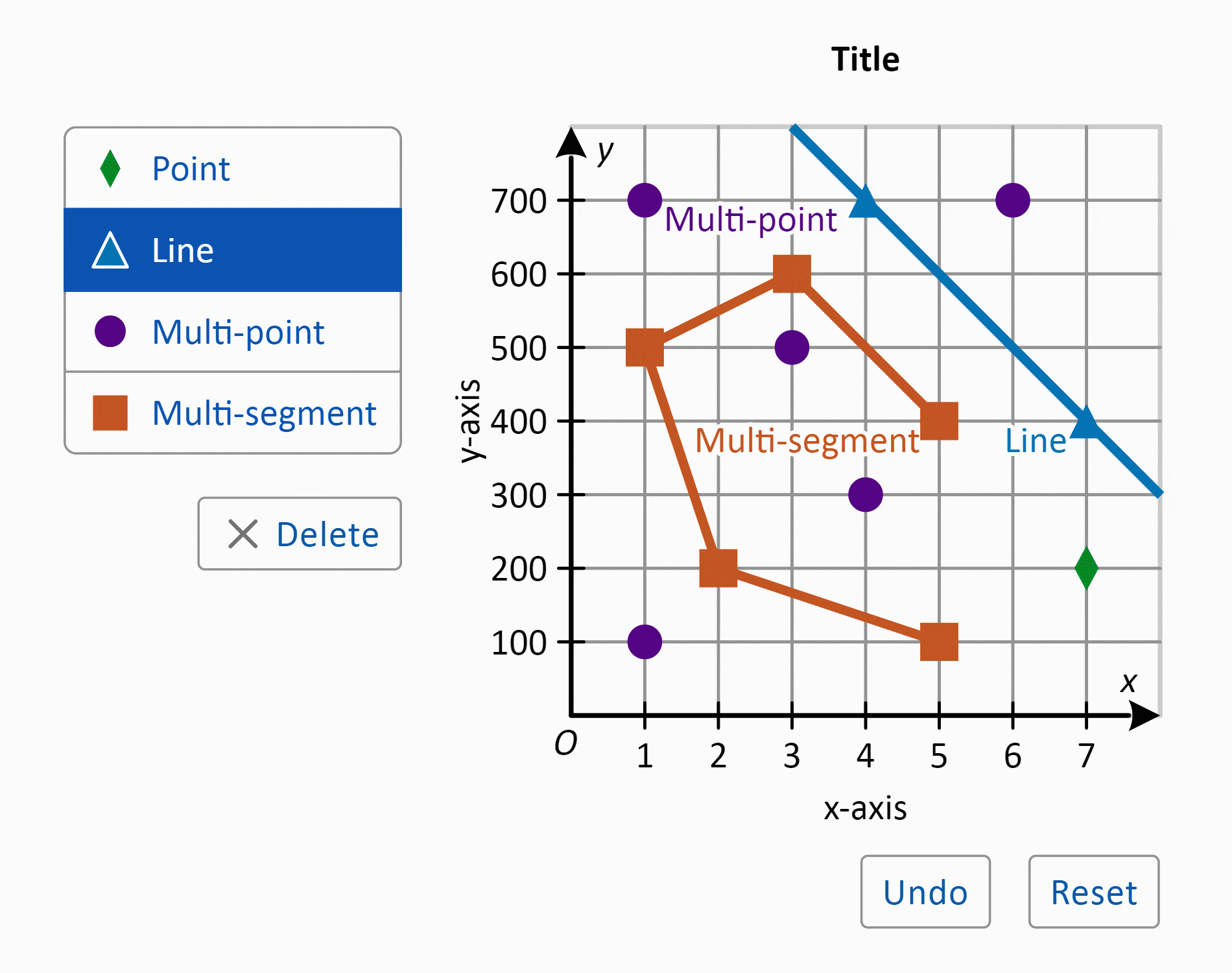
This graphing tool was particularly tricky to make fully keyboard navigable, as it includes multiple objects, deletion functionality, and free-form manipulation of points, lines, and line segments. Collaborating with accessibility specialists and developers, I designed an approach that applies tab grouping and an arrow-key-controlled reticle, leaning on commonly-tried keys and patterns to help keyboard users discover functionality.
Another aspect of accessibility was the creation of two additional color themes (Dark and Low Contrast) for all components, allowing students to toggle between themes on-the-fly.