Pratt Usability Study
This school project had us work with the Pratt library to research certain interactions and user flows on their website. A 6-person remote moderated usability study was conducted to focus on two specific aspects of the site - the ask-a-librarian feature and the account login flow. Through study participant evidence and majority conclusions, a number of recommendations for improvement emerged.
Ask a Librarian Feature
This feature includes the buttons and interfaces within the live chat feature. The study focused on a number of aspects, including chat button positioning, iconography recognition, window handling, and text box messaging. While some of these conclusions could be assumed based on emerging conventions for chat box functionality, the study aimed to quantify those assumptions so that the library can push for improvement with user evidence to back future proposals.
Recommendation 1 - Move the Ask a Librarian button and chat window to the lower right corner of the window.
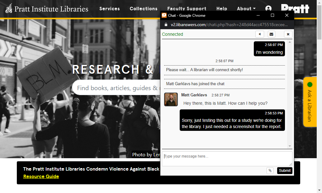
Current position of "Ask a Librarian button. The chat window pops out into a separate, overlaying browser window.
Current position of the "Ask a Librarian" button. The chat window pops out into a separate, overlaying browser window.
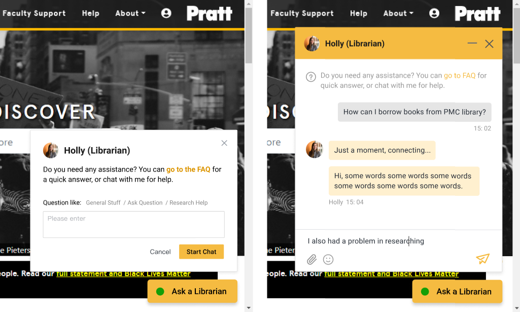
Proposed new chat button and window position would better meet participant expectations.
Proposed new chat button and window position would better meet participant expectations.
Currently, the Pratt Library chat button is anchored to the right edge of the screen, and when pressed, opens a new chat window. Based on participant feedback, our team recommended moving the button and chat window to the lower right corner. While this change is fairly straightforward to align with chat box conventions across the wider web, this conclusion provided evidence for the client to bring to their chat box vendor to push for improvement.
- 5 of 6 participants would prefer the chat box be in the lower right corner of the screen.
- 2 of 6 participants cited prior experiences with chat boxes located in the bottom right corner of the screen.
Recommendation 2 - Clarifying the pre chat question screen text labels and style will improve user understanding and visual preference.
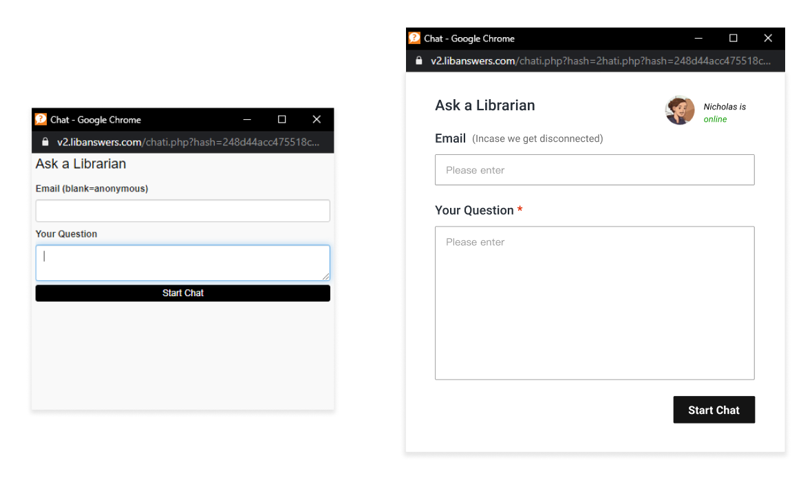
Shown left is the current chat prompt, right is a proposed variant that incorporates participant feedback. A number of smaller styling and labeling changes should improve people's willingness to leave their email, as well as follow through with the chat process.
- 2 of 6 participants would rather leave the email field blank. When told that the email would be used to reconnect incase the chat disconnected, 5 of 6 participants would provide their email.
- 3 of 6 people had negative perceptions on the window aesthetics (“it’s pale”, “visually unappealing”, “a little simple”, “the top link is unnecessary”).
- 2 of 6 people said they’d be more likely to use the chat feature if there was a librarian name and/or icon (“put a face to a name”).
Account Login
For the account login, we tested participants ability to move through the login screen, and asked them a series of questions relating to ease-of-use, understanding, aesthetics, and ideas for improvement.
Recommendation 3 - Generally the login page was understandable. Smaller updates like text and bug fixes will help improve this page in the interim, before single-sign-on is implemented.
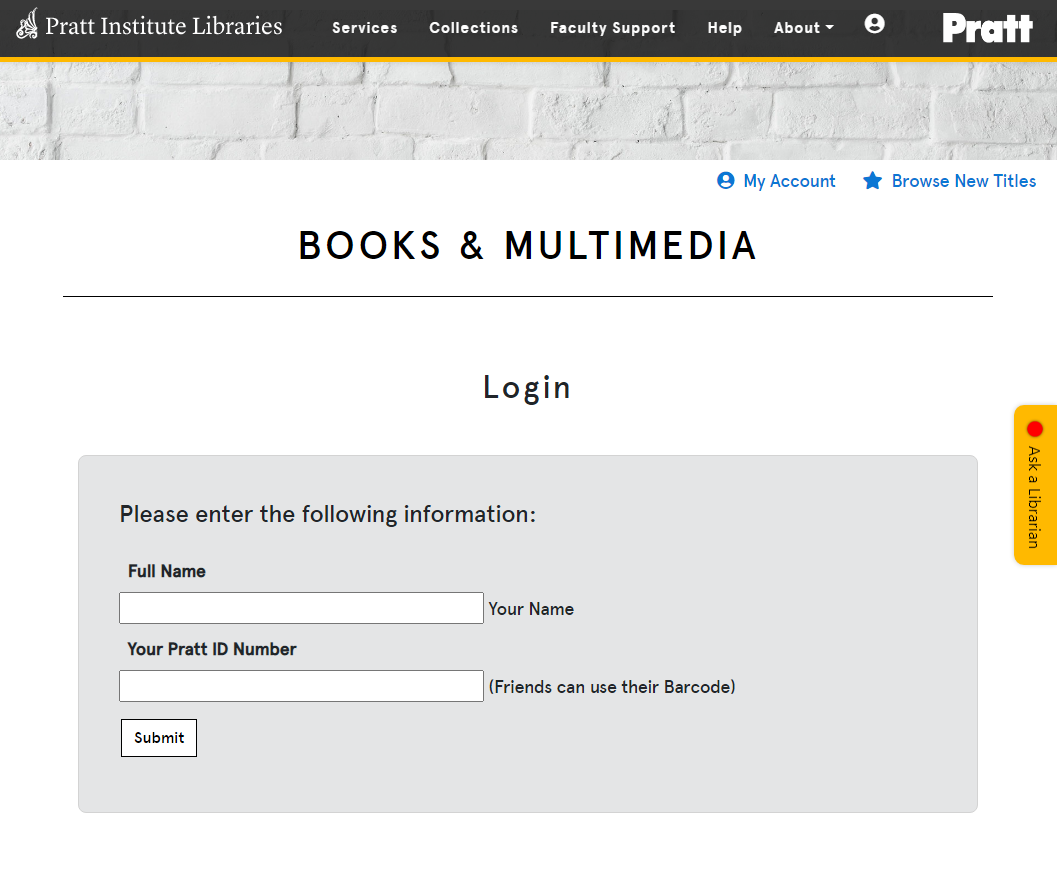
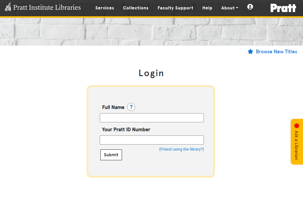
Shown left is the current login screen, right is a proposed variant that incorporates participant feedback. Removing the unnecessary "Books and Multimedia" heading, explaining what "Friends can use their Barcode." means, and clarifying the Full Name field will all simplify this page and address participant confusion.
- 3 of 6 participants did not understand the “friends can use their barcode” text.
- 2 of 6 participants commented that the “Full Name” and “Your Name” labels were repetitive.
- 2 of 6 participants would like to use their OneKey ID and password to login.
Conclusions
Through this 6 person usability study, evidence supported a range of improvements that can be prioritized based on budget, ongoing library initiatives, and impact on users. Low difficulty improvements, such as labeling and messaging, may be prioritized for the greatest impact-to-cost ratio.