Assessments Can Look Nice Too
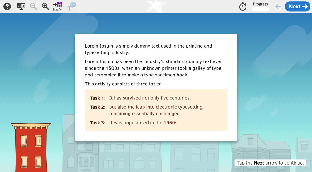
This series of projects consists of four 30-minute reading assessments for 4th and 8th graders. As the UX/digital designer, I provided end-to-end design solutions that encompassed everything from early wireframing and storyboarding to final art and animation asset creation. While the assessment field still struggles with ugly interfaces and bland content, I’d like to show that it doesn’t have to be this way.
Global Atribution
I want to thank Hilary Persky (Content Lead) and Lonnie Smith (Dev Lead) for being such great team members. You were a joy to work with, and I wish all my app teams were so small and nimble.
All content owned by the National Center for Educational Statistics and the United States Department of Education.
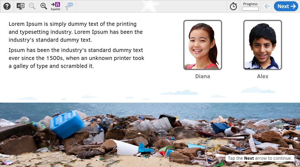
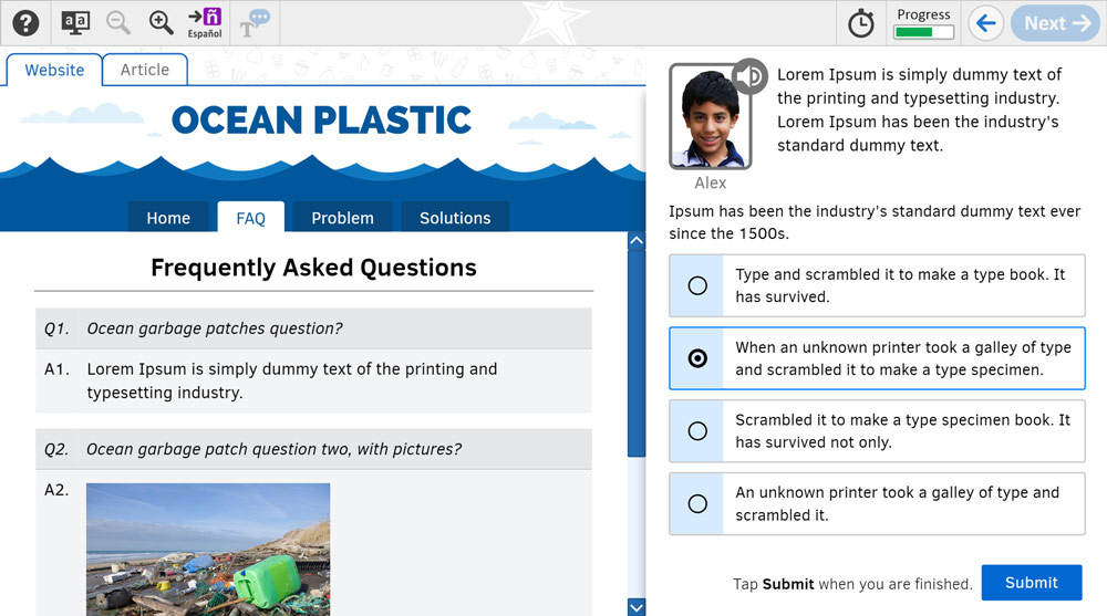
Oceans of Plastic
This task teaches students about the problem of microplastics in the ocean while measuring their reading skills in target areas like critique, evaluation, interpretation, and locate/recall.
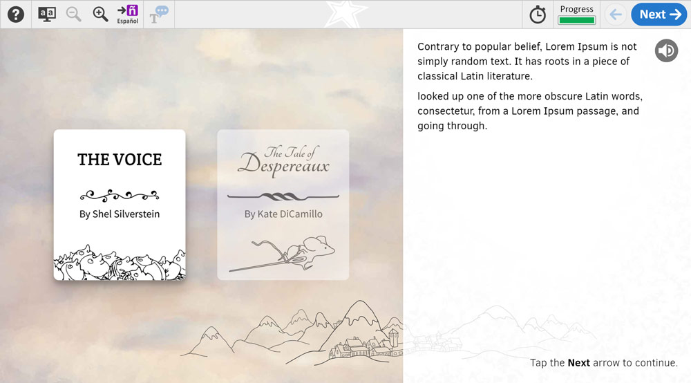
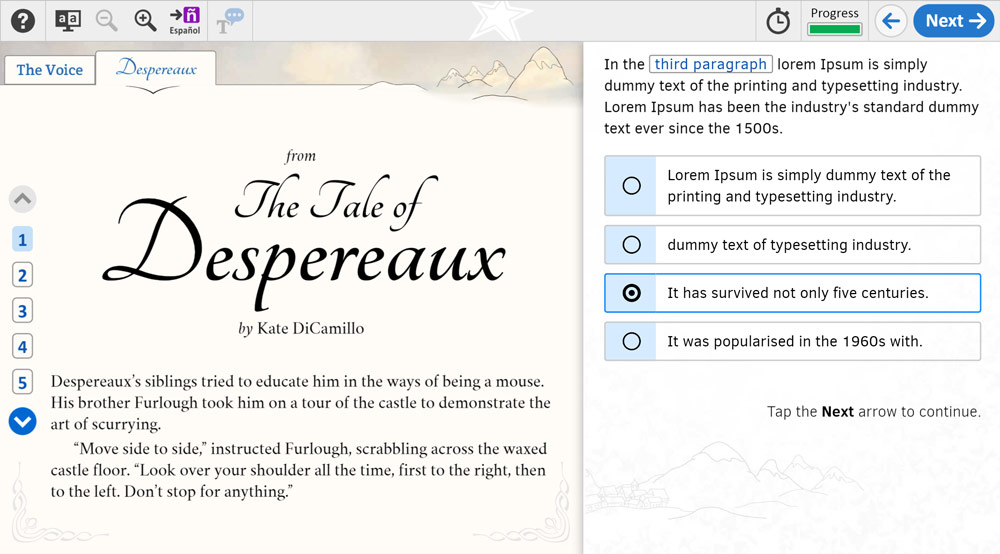
The Tale of Despereaux
This task differs from others in that we experimented with a simpler, character-less design. I quite liked this approach because we were able to lean on the core reading passages and my UI/art for engagement while omitting the added text load characters bring about. Art and UI design was inspired by the source materials (Shel Silverstein’s iconic ink illustrations and Timothy B. Ering’s Despereaux book cover art).
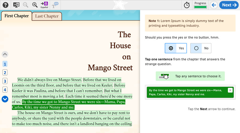
Mango Street
Like Despereaux, Mango Street was another character-less reading task. I pulled inspiration from The House On Mango Street’s book cover art, as well as the architecture surrounding the actual house in Chicago.
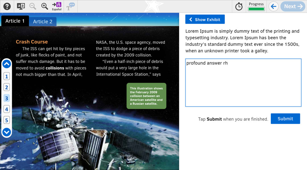
Space Junk
This task introduces students to the problem of space junk, reinforcing the need for international cooperation to keep local space around Earth clean. In addition to UI/UX and background art, I also created two videos for this task.
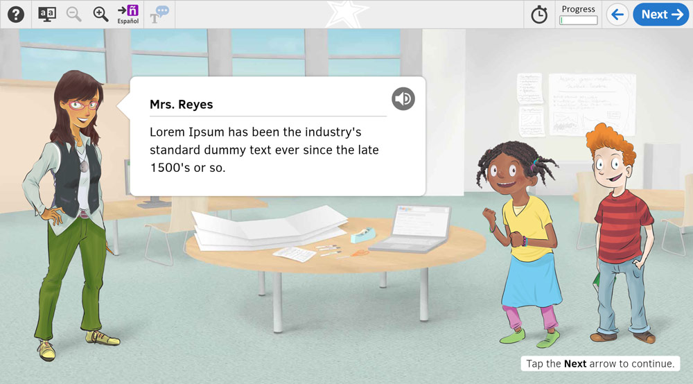
Character art by Dave Coats.
