Toolbar Redesign
One of my main goals working for the National Assessment of Educational Progress (NAEP) was to make things look better. Long did I stare at this toolbar, waiting for the day that I could update it.

After much insisting that we badly needed a refresh, I finally got to re-design it! Keeping the mountain of client requirements in mind, I stripped away extraneous skeuomorphic detail, reenvisioned the hierarchy, and re-designed the icons, states, and color themes:
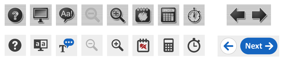

How much color to use was a really interesting study, as I needed to balance a number of considerations.
- The client expressed great interest in the assessment getting more colorful for engagement purposes (the classic “make it pop!” request -_-).
- This toolbar can sit overtop of content with a wide range of color palettes.
- Tools that were linked to many toolbar buttons had color themes already established, such as text-to-speech creating blue outlines around TTS content.
- The NAEP project places extreme emphasis on maintaining trend, or the ability to compare assessment results across decades of data. How does an icon refresh and addition of color impact a students ability to identity and access tools, and could that in-turn affect their performance on the assessment?
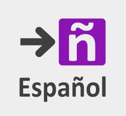
Deep Dive: The Spanish-English Toggle Button
Designing an icon to toggle between English and Spanish proved challenging, as we found no strong precedent beyond universal change-language icons. While this iconography seemed to be standardizing at the time of design, we needed an icon that more specifically communicated English-to-Spanish, and vice-versa. I began one of my favorite design processes, rapid iteration, to conceptualize ideas.
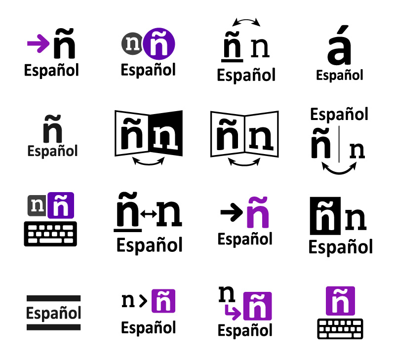
We quickly decided that an explicit text label would be required for this button. But, what about the icon? My solution was to integrate one of the core textual differences between spanish and english - the eñe (ñ). Combining this letter with an arrow to help denote “go to”, we landed on a three-part solution that packaged neatly into the square button slot.
Special Thanks
Just want to give a shout-out to Michael Friesenhahn, who was instrumental in translating these designs into a working product. He provided invaluable critique every step of the way, added that nice toggle animation to Change Language button, did the HTML/CSS implementation, and handled all of the client management stuff.
All content owned by the National Center for Educational Statistics and the United States Department of Education.
Retrospective
Thinking back, we should have pushed harder for full text labels. It was certainly proposed,
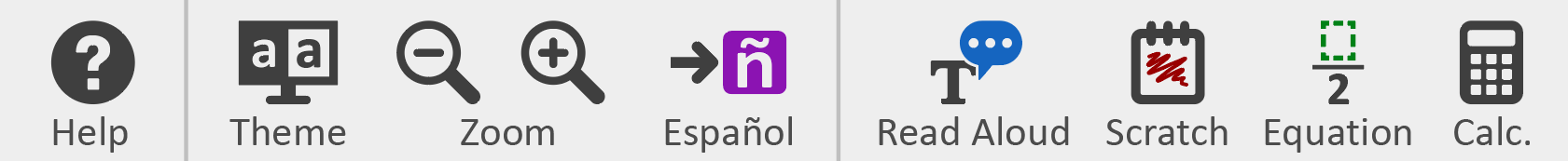
but the client did not like the added text load and was concerned over trend implications (the previous toolbar version had no labels). I believe this was a big mistake given how important labels are, and have some regrets over not dying on this hill.